Project Overview
Who: Client- Life Coach for corporate professionals.
What I did: Branding, logo, collateral & promotional design.
Goals: To rebrand the business as bold and inviting within the corporate space for an upcoming launch, and to pay homage to a life-changing trip in Puerto Rico, where it all started.
Process: After our initial strategy call, I began with exploration and research. Next, I chose a direction and designed the logo. Then refined the designs based on client feedback. I finalized the project by creating a brand style guide and promotional assets.
Tools used: Figma, Canva, Adobe Photoshop, and pencil & paper.
Business Cards.
Strategy
The Problem
To create a brand identity and supporting graphics that target a specific niche within the real estate industry.
I initially created the logo, color, and font palettes, and a real estate yard sign.
Proposed Solution
To rebrand the business as bold and inviting within the corporate space for an upcoming launch, and to pay homage to a life-changing trip in Puerto Rico, where it all started.
I wanted to create an identity that felt vibrant, colorful, and fun but also professional and trustworthy. I included aspects that made the brand feel like a travel brand to bring out that life and work are an adventure to be enjoyed to the fullest.
Research & Development
I completed visual research on Pinterest and created a moodboard that conveyed the overall aesthetic, colors, and fonts I wanted to use for the brand.
Work in Progress
Primary Logo
Submark
Initial Concepts
I used a bold, script font for the logotype to communicate the “Live Huge Factor.”
Issues
While the font was a good choice, the logo felt empty; something was missing to make it feel complete.
Final Logo Concepts.
Iterations
Revisions
The client liked the overall direction but wanted the monstera leaf to be included in the logo as a homage to the life-changing trip in Puerto Rico.
Next Steps
The leaf, as well as adjustments to the tagline, were just what the logo needed to feel complete and aligned with the brand’s message.
I created a badge logo that added to the travel-adventure feeling of the brand.
I pushed the brand further by refining the color palette and creating a full logo suite, brand pattern, collateral, and promotional assets.
Applications
Primary Logo.
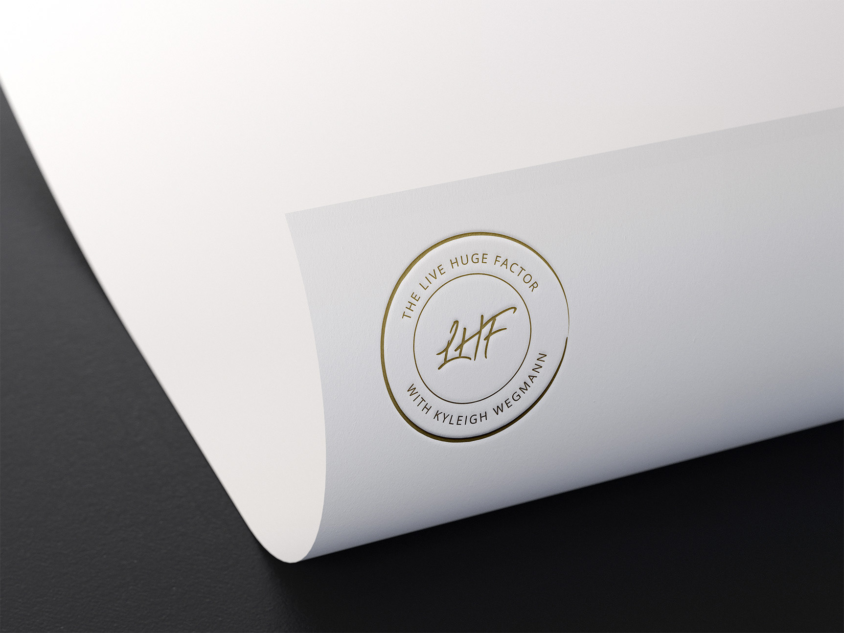
Badge Logo.
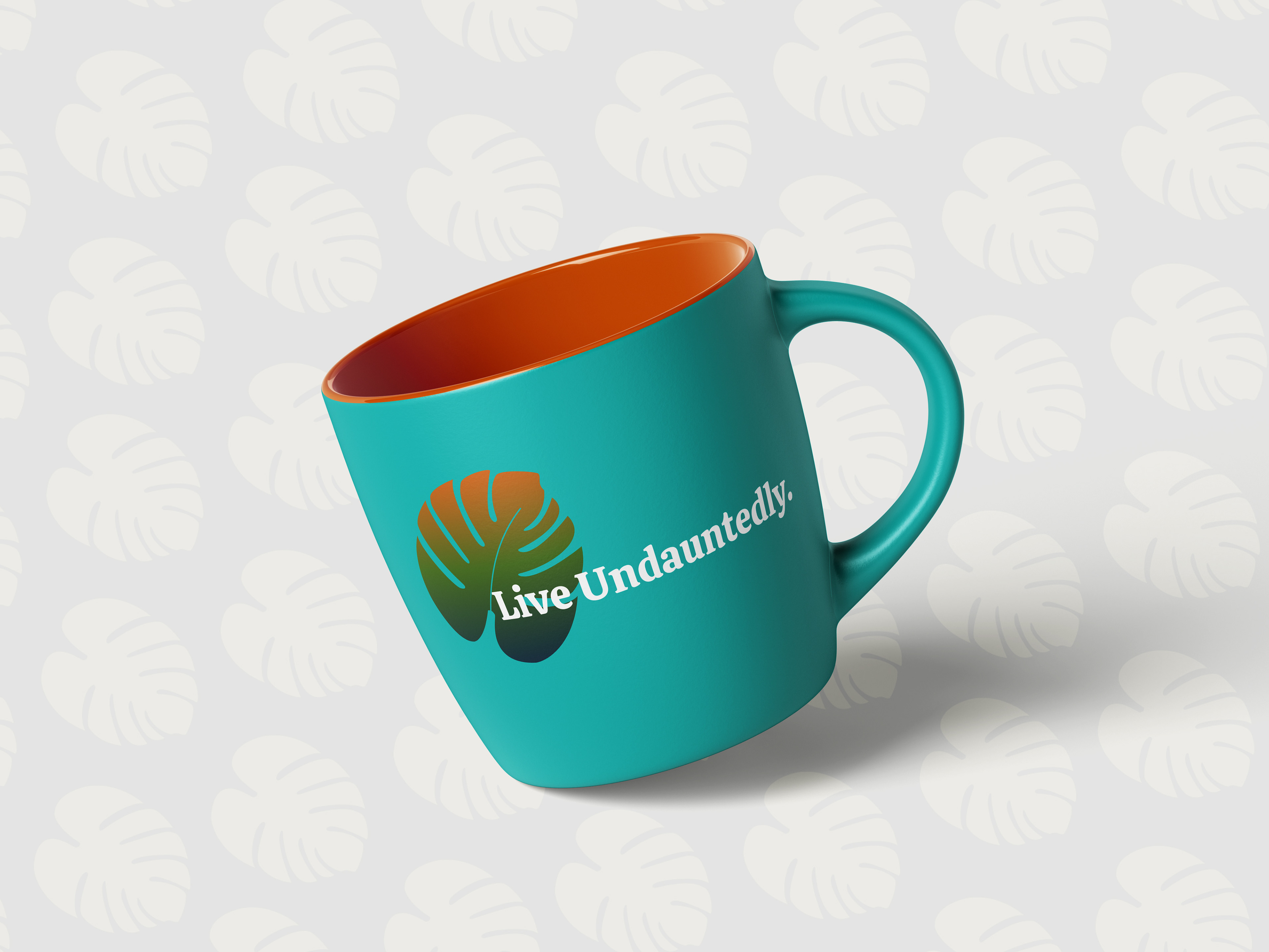
Tea Mug.
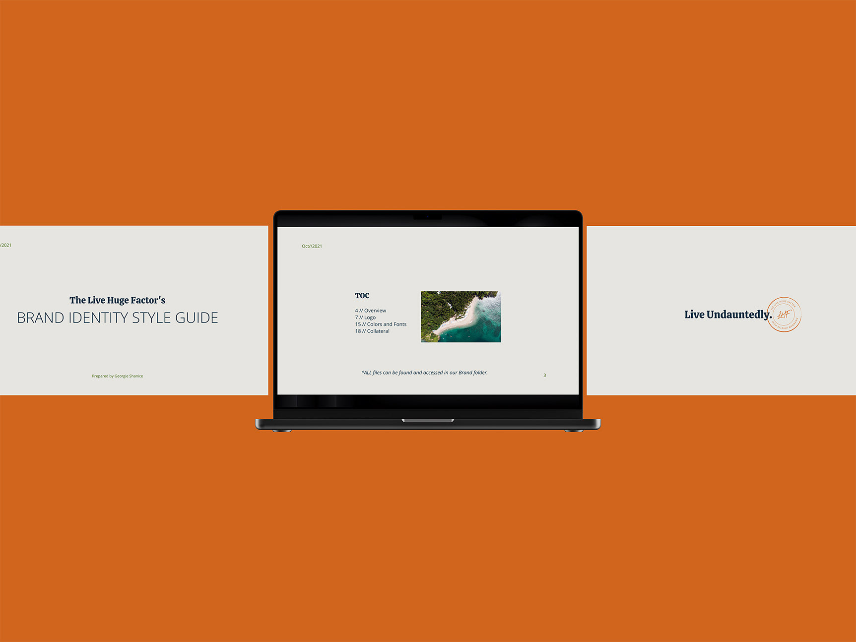
Brand Style Guidelines.
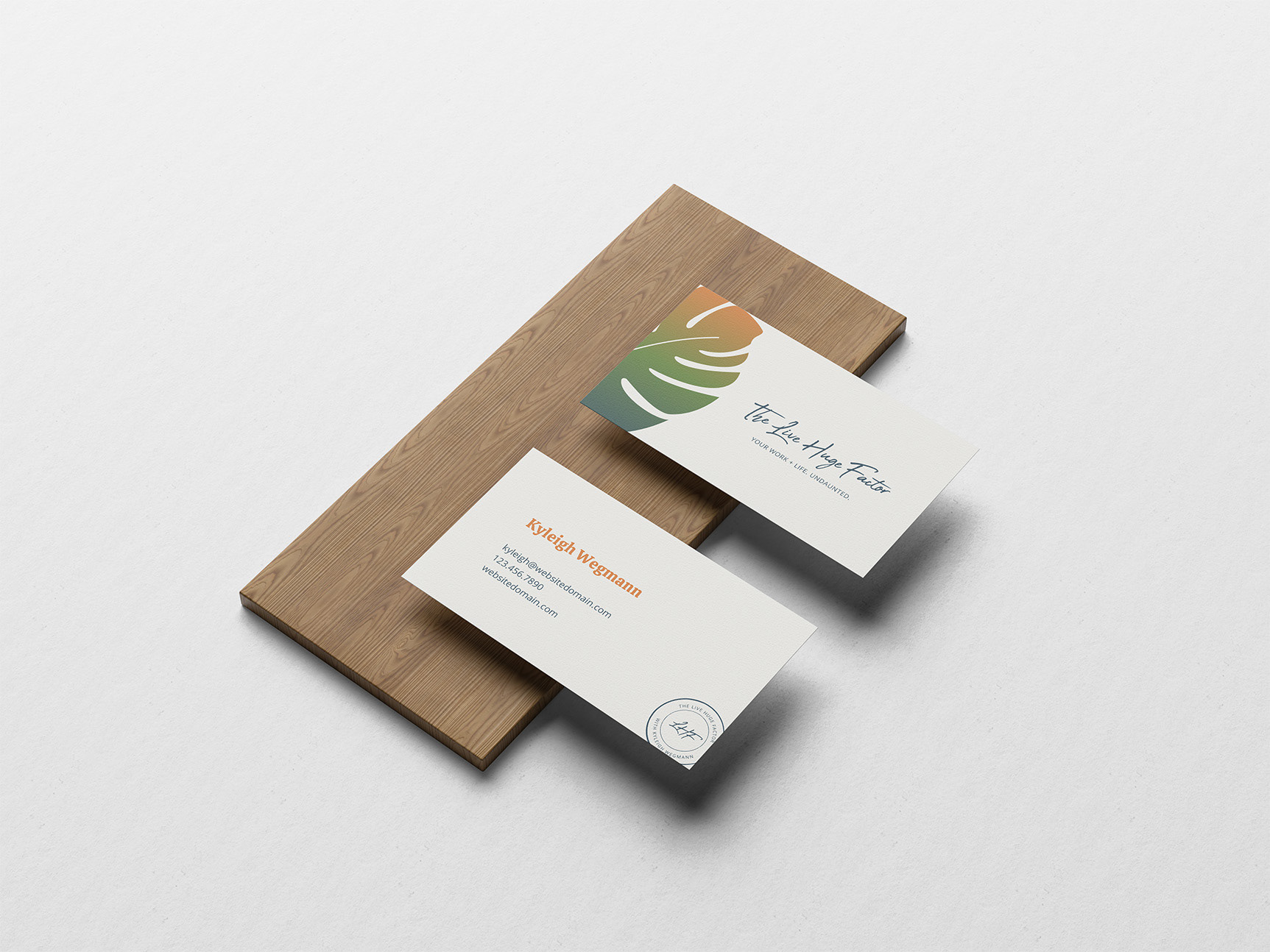
Business Card.
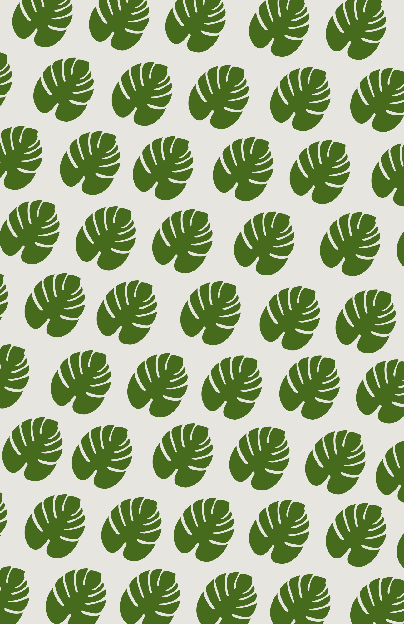
Brand Pattern.
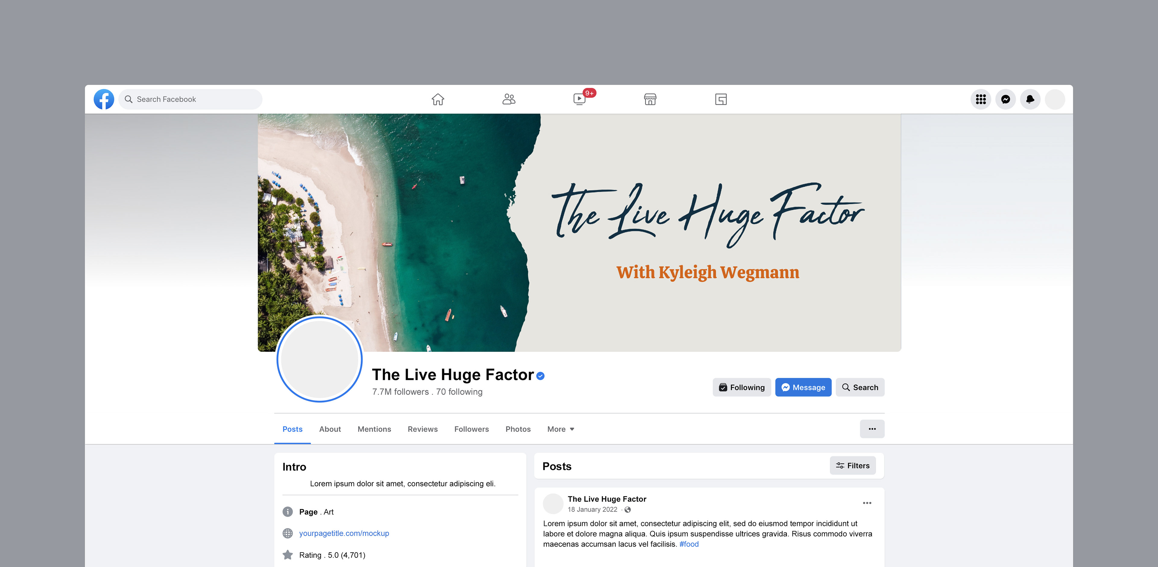
Facebook Banner.
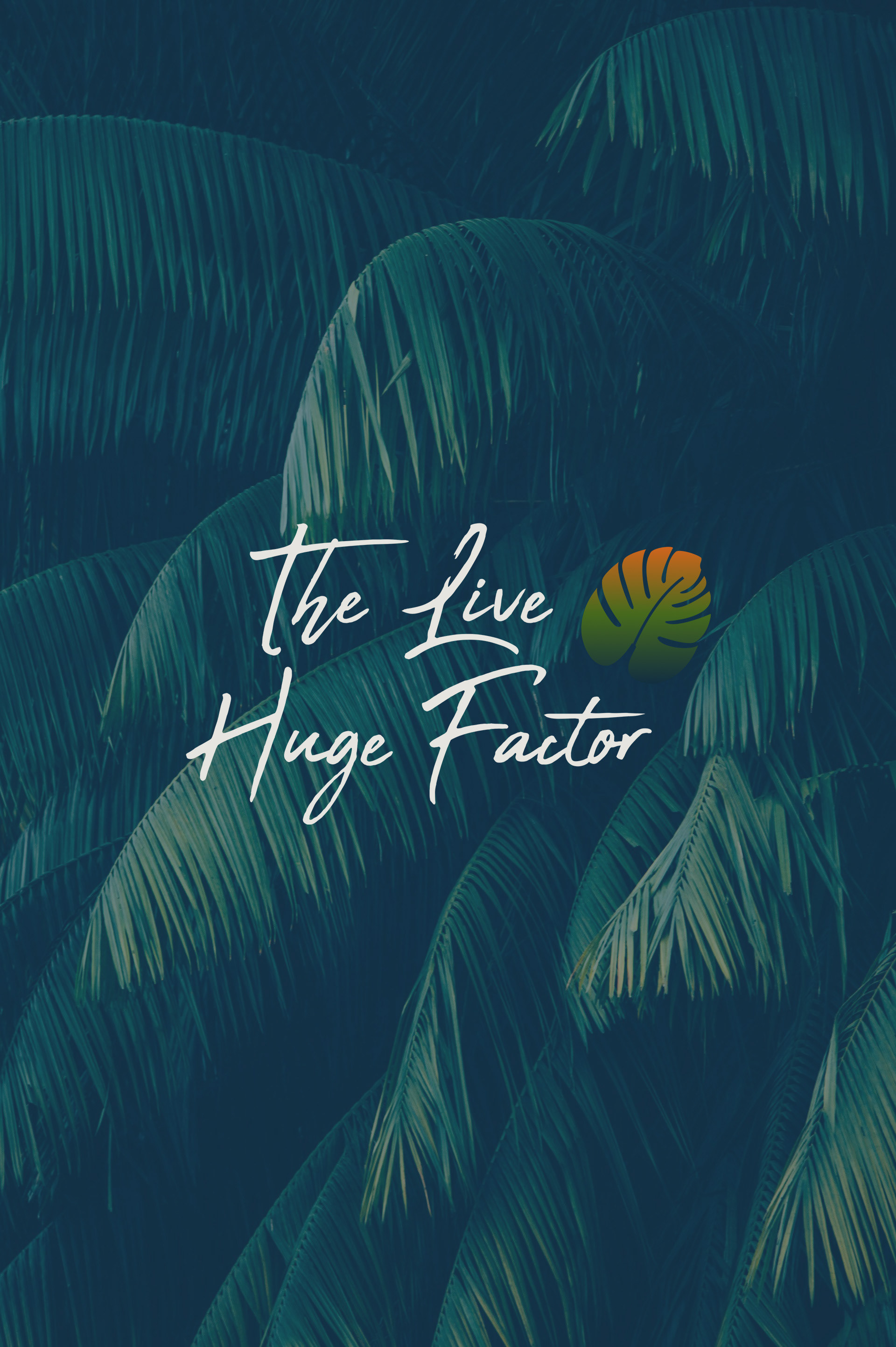
Secondary Logo.
Conclusion
Goals: To rebrand the business as bold and inviting within the corporate space for an upcoming launch, and to pay homage to a life-changing trip in Puerto Rico, where it all started.
Outcome: One Love is a brand that embodies authenticity and adventure in work, play, and everyday life. You can be yourself in and outside the office, and live undauntedly. Through research and an intentional design process, I was able to communicate the heart and message of this brand.
