Project Overview
Who: School Project- Identity & yard signage design for a local real estate agent.
What I did: Branding, logo, marketing, and promotional design.
Goals: To create a brand identity and supporting graphics that target a specific niche within the real estate industry.
Process: I chose the luxury, family-home market; after completing research, I developed some ideas and initial concepts. I revised my strongest concept as needed and created applications for the digital and print promotion of the brand.
Tools used: Adobe Illustrator, Photoshop & InDesign, and pencil & paper.
Logo on rubber stamp.
Strategy
The Problem
To create a brand identity and supporting graphics that target a specific niche within the real estate industry.
I initially created the logo, color, and font palettes, and a real estate yard sign.
Proposed Solution
I chose the luxury, family-home market because I wanted to create a brand that felt high-end but also understated.
I wanted to incorporate high-quality photography, a neutral color palette, and fonts that had personality but were tasteful and maintained their readability at different viewing points.
Research & Development
I researched the luxury home market, and how real estate agents in that niche presented themselves and the homes they sold.
It confirmed my initial idea of choosing a neutral palette, but I wanted to incorporate a pop of color.
I did more visual research on Pinterest and created a moodboard that conveyed the overall aesthetic, colors, and fonts I wanted to use for the brand.
Ideation
Logo design sketches.
Yard sign design sketches.
Sketches
I chose a monogram logo because the minimal design would communicate the brand’s value, and it's often seen in luxury, high-end markets.
Work in Progress
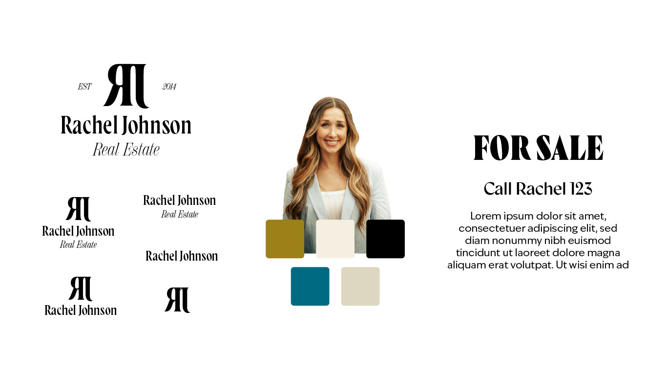
Brand identity for real estate agent.
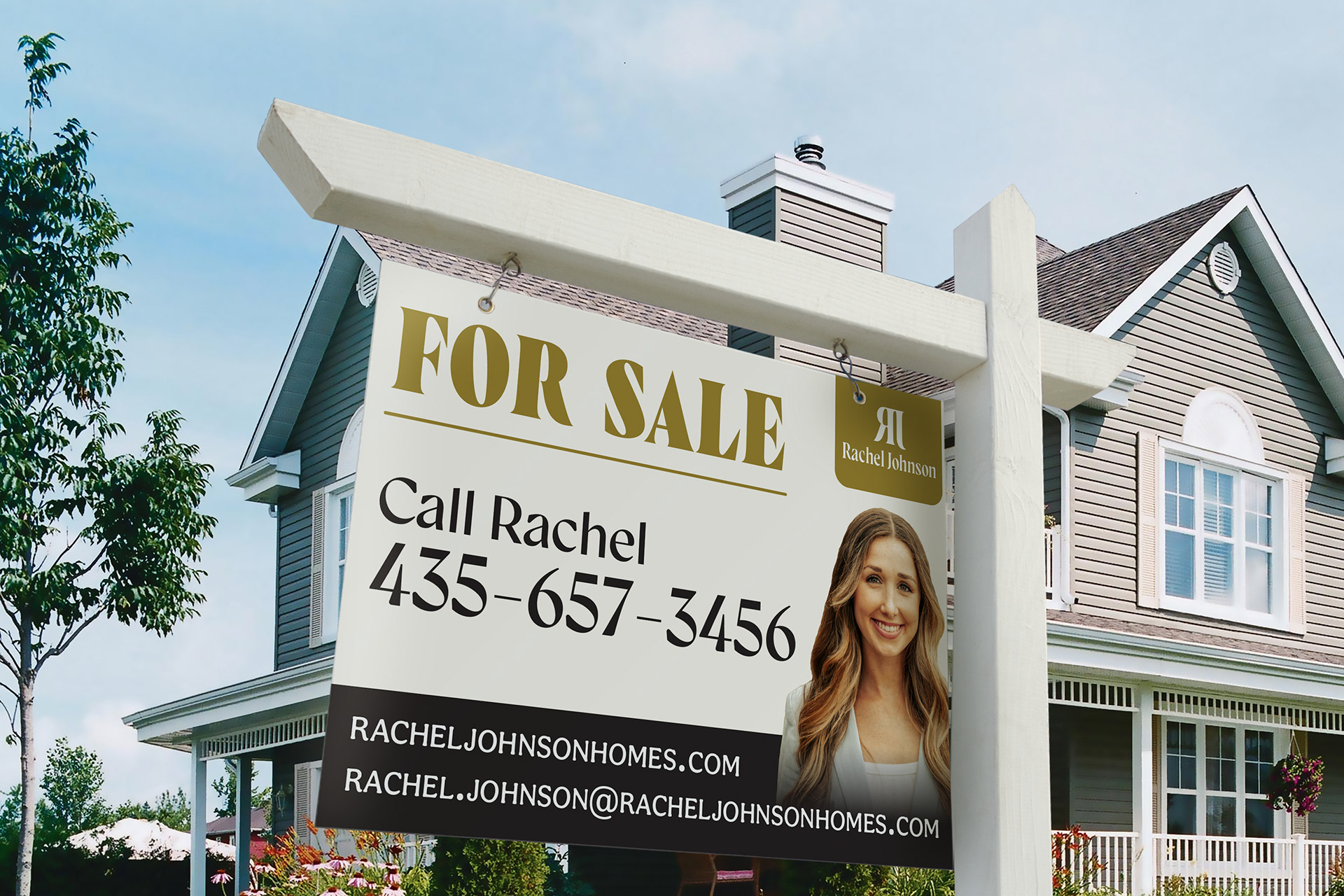
Real estate yard sign.
Initial Concepts
I used the initial logo to create a logo suite that would allow the brand to be used in all applications. I went with a neutral color palette, inspired by many of the homes found in the luxury market, but included a bold color. I chose serif fonts that are easy to read and added to the overall high-end aesthetic.
Issues
Since I was only creating one application, the yard sign, it was challenging to incorporate all the colors in a way that felt cohesive. I decided to keep the sign simple and use only the gold, black, and cream colors. I was also challenged with the amount of information I needed to include on the sign.
New real estate yard sign.
Iterations
Revisions
Specifically about the yard sign, my instructor reminded me to make sure all the text is readable by choosing the right kind of fonts and contrasting colors.
Next Steps
I wanted to push the brand to make it feel more complete and elevated, yet also welcoming since a large part of real estate is about building trust and relationships. As well as address the challenges I had previously.
Brand essence keywords: sophisticated, understated, and elegant
I refined the color palette, and now it feels more balanced and warm. I also updated the fonts to feel more timeless and applicable for print and digital use.
Being a school project, I took the liberty of changing the brand name as well as reducing the amount of information on the sign to what was essential.
Applications
Primary Logo.
Primary Logo.
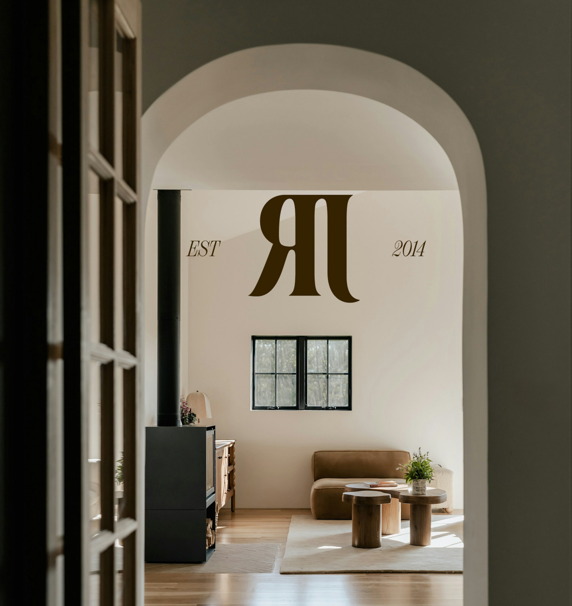
Secondary Submark.
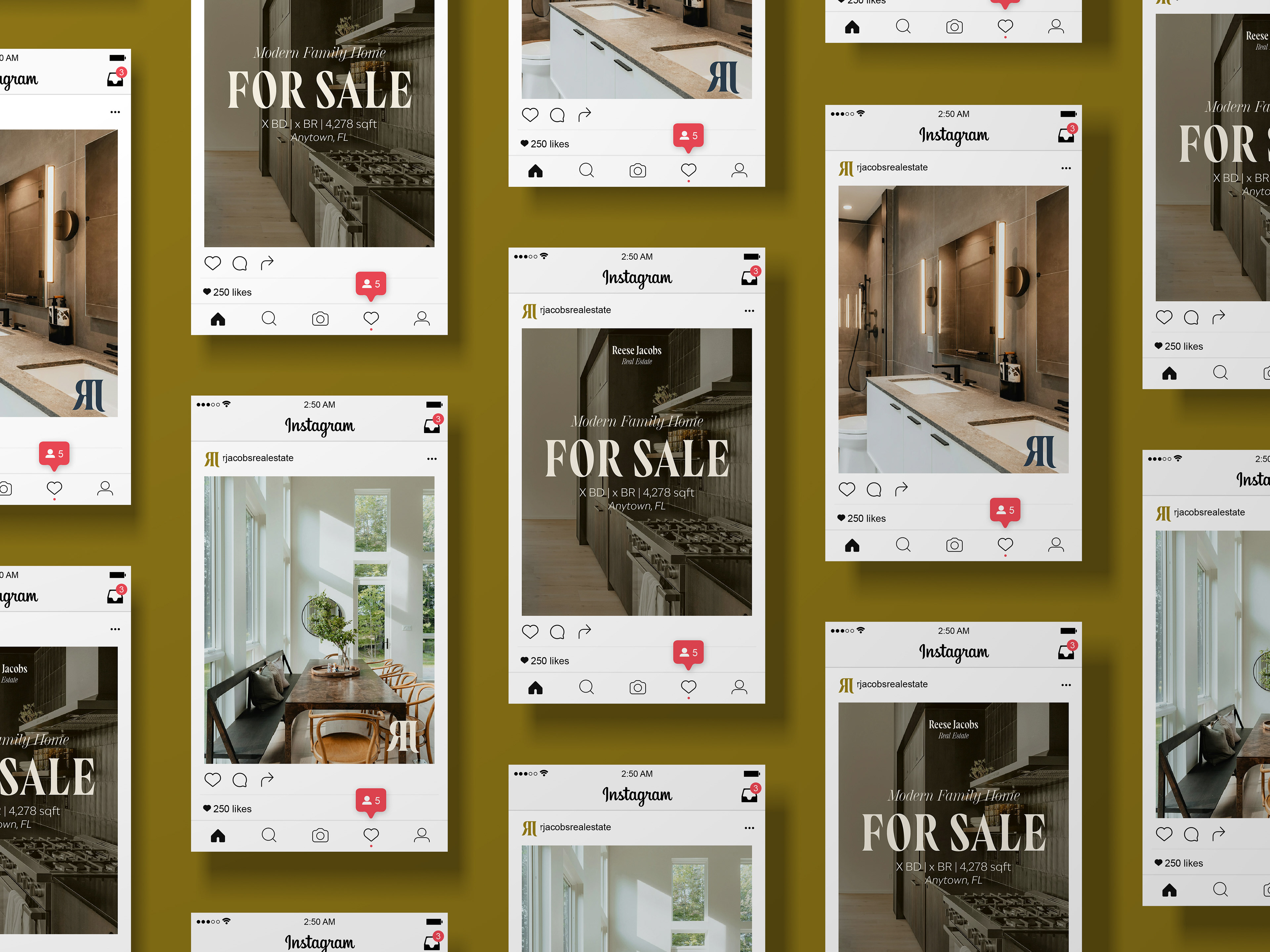
Instagram Posts.
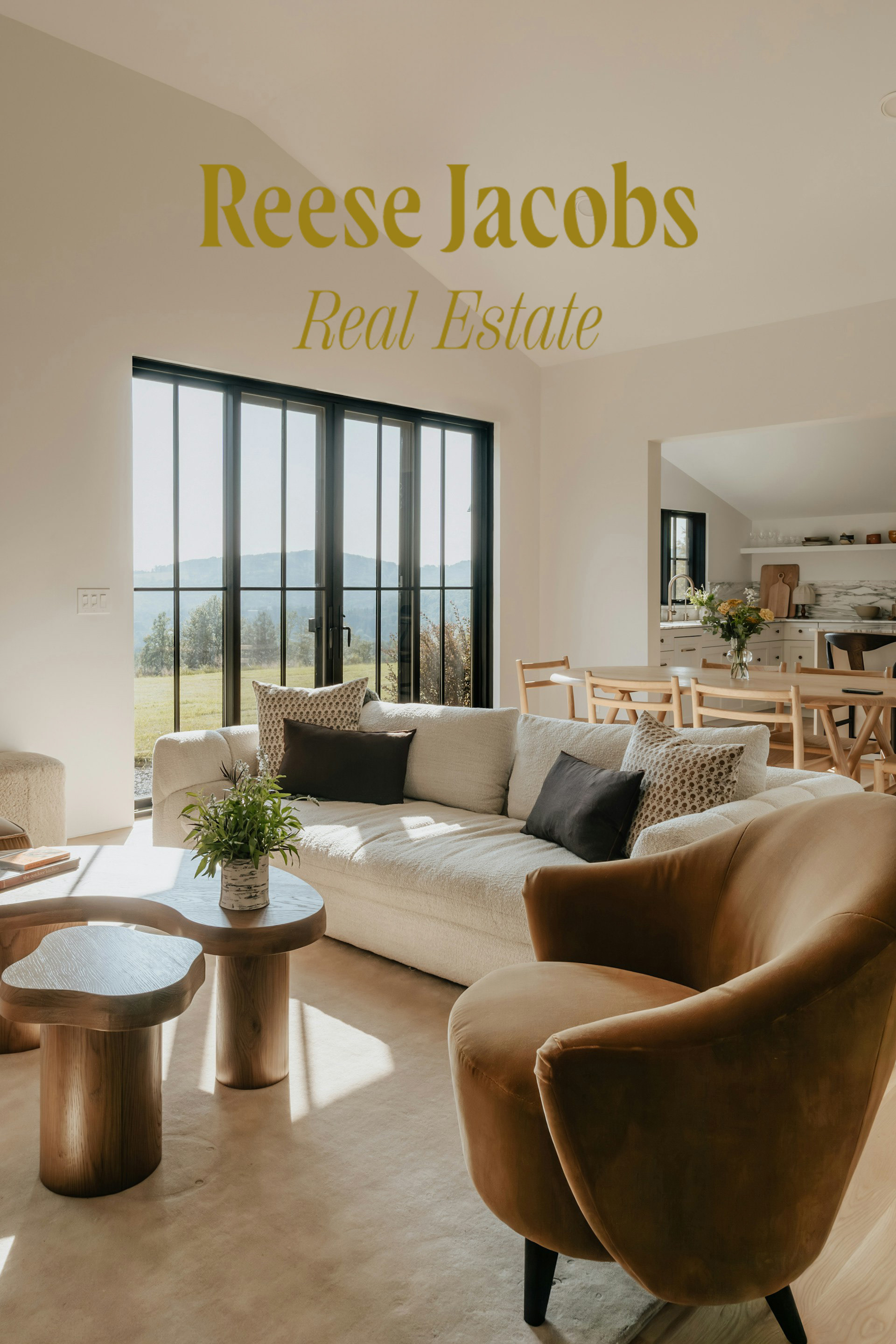
Primary Wordmark.
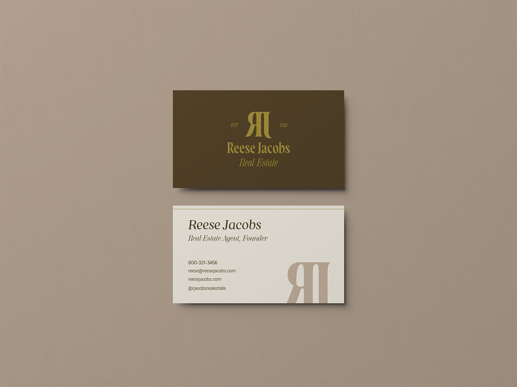
Business Card.
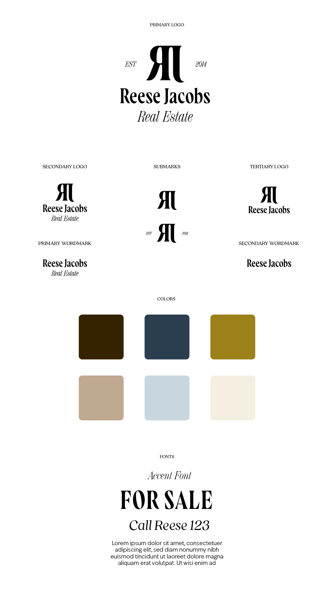
Brand Style Sheet.
Conclusion
Goals: To create a brand identity and supporting graphics that target a specific niche within the real estate industry.
Outcome: Reese Jacobs Real Estate is a brand dedicated to partnering with families and couples looking for their forever homes within the luxury housing market. Through research and an intentional design process, I was able to communicate the value and exclusivity of this brand.
